Digital Art
- Summer Rawlings
- Jun 10, 2019
- 6 min read
Updated: Jun 18, 2019

Just before christmas we were given a brief for an upcoming digital art project in which we make an art piece presenting either an ancient lost city or a magical, living forest. I ended up choosing a magical, living forest as I wanted to experiment with textures and plants in photoshop/ digital art.
Some of my early concepts included water, magical creatures and unusual plants but from the start I knew I wanted to include some sort of statue/ ruins and crystals. I looked at and experimented with different types of statues in which I was quite drawn to Buddha statues and a statue from the ride "Jungle Cruise" at the Disney Parks. Another inspiration towards my statue design was Golden Bridge in Vietnam, a bridge which is help up by two giant stone hands. I also liked the idea of a twisting tree in the foreground, inspired by Ta Prohm, an old temple with a tree twisting its way around the ruins for support.
For my first concept piece I had the statue in the centre with trees in the background and foreground. Once I had finished I didn't like how symmetrical it looked with having the statue in the middle and the trees frame the picture.

From this I started to rethink layouts and how I could make the statue stand out and have the piece be more interesting. I had then thought of a keyhole idea as something so small could have something massive on the other side. I started looking at references such as the ones bellow, my biggest being Alice In Wonderland, and after trying out a few different concepts, I was happy with my final plan.
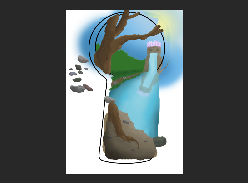
I opened up photoshop and started with the shape of the key hole as this will be the frame of my drawing. I then drew a basic outline sketch and blocks of colour for me to build on.
The first thing I added detail to was the tree as it's in the foreground and is a good reference for lighting and detail for the rest of the piece. I started by building on the block colour I had used earlier by added tone throughout the tree and, using a small brush, made slight markings to show depth, something I would come back later and add too. I also did the same with the dirt at the front.
I decided to next add depth to the sky and draw clouds. For the clouds, I used a light paint brush to a large scale to create a speckled effect.
After the sky I moved onto the main piece of my drawing, the stone statue. Like the tree, I built up tone and shading, then going in with a small brush to make slight brick patterns and cracks in the stone. To make the stone look more realistic and add texture I went in with a speckled brush and a slightly darker colour then the base and used this all over the statue. Using the same brush, I used a dark green colour to add the effect of moss which added age to the statue.
From the start I knew I wanted to include a water feature coming from the statue, which I resulted in a water fall. I didn't need much detail in the water fall but I used tone and a misty brush for the splash at the bottom.

The final part of the statue was the crown of crystals and this was my favourite to make. I started off by drawing an outline of two different crystal, then adding colour and tone. As i've drawn crystals before I knew that light gets scattered, so I used a wide range of shades, with the lighter tones being used often. I then duplicated this crystal to different scales and colours. I chose to make pink and purple crystals because they are simular in colour and I felt it it added a range of depth to the crown. I placed some base crystals first, then filling in any gaps with smaller or thinner crystals, making sure to rotate them in a curved shape to make a more natural look.
For the foliage around the drawing I used a dry brush tool and a small range of green tones to create what looked like grass and made a simple textured dirt bank along the waters edge. For the trees I used a range of green tones and a textured paint brush tool to make what looked like a deep forrest. Once I had finished I adjusted the saturation to more grey tone as the further away you look into the distance, the more the saturation fades.
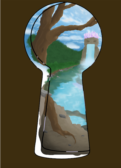
As I wanted water to be a big part in my piece, I made sure to include a flowing river from the waterfall. After building up tones I moved onto reflections. I did this by mirroring parts of the drawing that would be reflected on the water, used perspective warp to correct the way they reflected and brought down the opacity to make them more faint.
Before I created ripples in the water I drew a range of rocks which I wanted scattered downs the water bank. I spent a lot of time adding tone and detail to the rocks but I'm happy with how the looked in the final piece. Not only did I use the rocks I had drew in the water, but I later placed a few scaled down in the dirt in the foreground of my drawing as I thought this added texture and made the dirt look more natural and rough.
Using the smudge tool, I created ripples throughout the water, gathering around rocks and dispersing from the waterfall. To really make these ripples stand out, I used a white paint brush to highlight peaks in the water and light reflections.
It was round about this time that I decided I could improve on the clouds I had previously made. I got references from the interned and replicated them as best I could to my satisfaction. I found it was easier to draw the clouds on top of a black background as I could really pay attention to the detailing and shape. Once I brought them into my drawing I changed the perspective and opacity so make them less harsh and lighter.
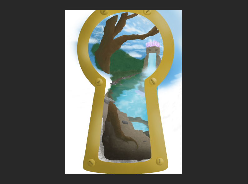
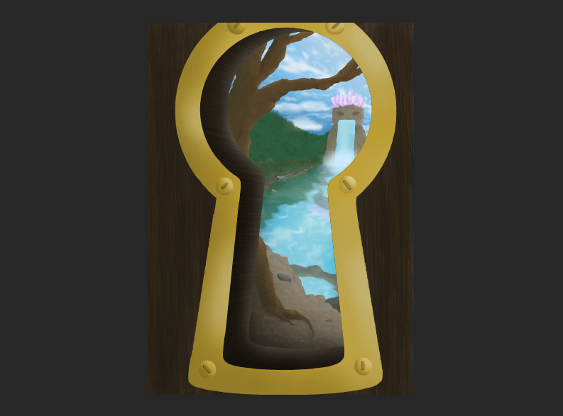
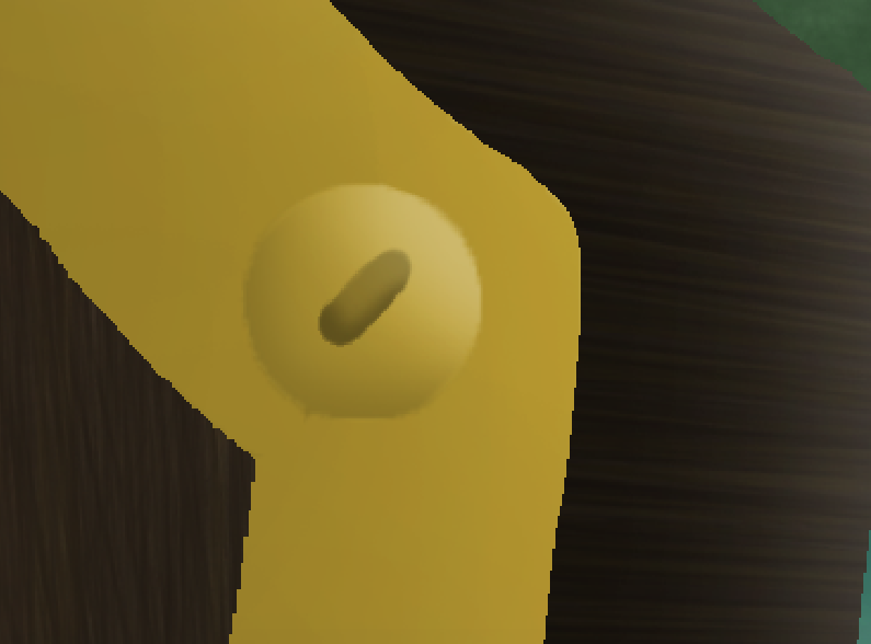
Once I was finally happy with my piece so far I started on the door and key hole. Similar to the start, I build tone and texture off base colours. I wanted to go for a classic golden key frame as this created a magical feel and I liked the contrast between the dark wood and shiny gold. As there wasn't much detailing that was needed to go into the key frame I added some screws to make it more realistic to an actual door.
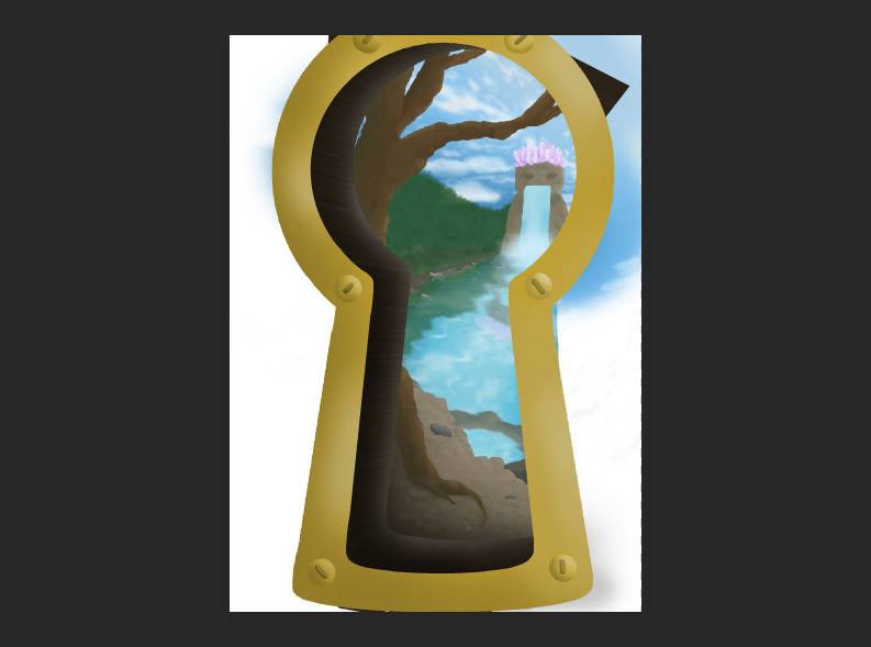
As for the door itself, I found the texturing extremely similar to the tree I drew at the start, however, I didn't need such a wide range of tones as I imagined light would be coming from the key hole, therefore, leaving the wood quite dark.
And here was my final product:

After submitting this piece in my grade was a Merit and on feedback given to raise my grade, it was suggested to make the light source from the door more prominent and to increase detailing in the water. After hearing this I turned down the saturation on the wood and key frame to make it duller and increased the contrast in the key hole which drastically made a difference with the light beaming through the other side. I had also gone back with a harder brush tool to really bring out the highlighted peeks in the water.
This was my final product:

After making changed to my digital art piece I was extremely happy with the final result as it made such a difference. Overall, I loved how it all came together and how something complimented each other, and others created a dominant contrast. My favourite feature is the crown of crystals as I think it brought some vibrant colour to a neutral painting and brings in a magical element. If I were to go back and change any details, I would like to experiment with and include a range of plants as I regret not making it look more tropical and overgrown.










Comments